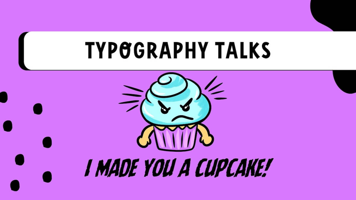
Typography might sound like a big word, but it is really just about one thing: how we make words look. Whether you’re drawing a poster, designing a logo, or creating art in Procreate or Canva, having an understanding of typography will help your words speak visually — even before someone reads them.
For tweens and teens learning digital art and design, understanding basic typography can help them level up their creativity. Here’s how to get started with typography for beginners, and why it’s such a cool part of the design process!
So, what is Typography?…
Typography is how you style your words so they look good, feel right, and help your message stand out. It’s not just about picking a font — it’s about choosing the right one and playing with size, spacing, and style.
Imagine writing the word “BOOM!” in curly handwriting…

It just doesn’t feel right, does it? Typography helps match the feeling of the words to the design around them.
Even when the words stay the same, typography can totally change how they come across. Take this for example:

One choice looks more sweet than the other, right? That’s the power of Typography. It lets you control not only what you say but also how it feels to those viewing it. Whether you are trying to make someone laugh, get excited, or “KEEP OFF THE GRASS!” The right choices help to set the mood before anyone reads the message.
And it’s not just about the font, the space between your letters and lines plays a big role too. These little details make your design easier to read and way more fun to look at.
Let’s break down three key typography terms every young designer should know:
The 3 Typography Terms Every Young Designer Should Know:
1. Kerning:
Kerning refers to the space between individual letters.
Too close, and they crowd together… too far, and they feel lost!
Example:

Get it just right, and your design instantly looks more polished.
2. Leading:
Leading (which, btw….rhymes with breading, not feeding) is the space between lines.
Tight leading makes things feel squished. Too loose and your message might get lost.
Example:

Get your leading just right and your designs will be easy to read.
2. Tracking:
Tracking is like kerning’s cousin, but it adjusts the spacing across the whole word or sentence. It can make things look airy and elegant or tight and bold.
Example:
Designers use tracking to balance out space when they’re designing posters, titles, or social media graphics.
So why does Typography matter?
Typography is everywhere — logos, books, game interfaces, menus, YouTube thumbnails, and apps and more.
Learning to use typography early gives young creatives a head start in graphic design and helps them feel more confident in their work.
Plus, it’s just fun! You can make letters dance, stamp, whisper or shout, all with the right font and spacing.
Tips for Young Creatives to explore Typography:
- Start with a simple font (like Arial or Montserrat). Choose a word, or words, like “Happy Birthday”, “Silly Goose”, “Thank you” or “Boo!” and then experiment with font choices, the leading and tracking to see how it changes the message.
- Add text to a canvas in Procreate, and experiment with the different choices and settings.
- Explore the “Spacing” tool in Canva under the text options.
- Try different font combinations, e.g. one bold, one fun, and see if you like the contrast.
Let Your Letters Speak!
Learning typography isn’t about perfection, its about exploring how letters look, feel, and move within your creations. With a little practice, you’ll start making typography choices that feel just right in your projects.
Because every font choice, curve, and space?
Is a part of the story you’re telling.

